Flex Box

Hi, Flex Box is one of the ways to create beautiful layouts for a web page/ web app.
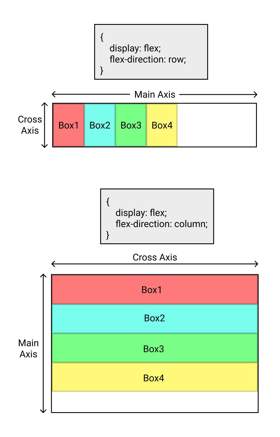
You can convert an element into flex-box container by setting display property to flex. Once an element is defined as flex-box, the items inside the flex-box container becomes flex-items. By default these items are arranged horizontally. The direction of arrangement can be changed to vertical by setting flex-direction property to column.
Once the flex-direction property is set, the axis along which the flex-direction is set is called 𝑀𝑎𝑖𝑛 𝐴𝑥𝑖𝑠 and the one perpendicular to it is called 𝐶𝑟𝑜𝑠𝑠 𝐴𝑥𝑖𝑠.
Justify-content property of flex-box container is used to adjust the positioning of flex-items along the 𝑀𝑎𝑖𝑛 𝐴𝑥𝑖𝑠.
The values for justify-content property include
- flex-start (default)
- center
- flex-end
- space-between
- space-around
Check out the cheat sheets below
align-items property of flex-box container is used to adjust the positioning of flex-items along the 𝐶𝑟𝑜𝑠𝑠 𝐴𝑥𝑖𝑠.
The values for align-items property include
- stretch (default)
- flex-start
- center
- flex-end
Check out the cheat sheets for all possible combinations
flex-wrap property of flex-box container is used to wrap the flex-items to next line along 𝐶𝑟𝑜𝑠𝑠 𝐴𝑥𝑖𝑠.
The values for flex-wrap property include
- nowrap (default)
- wrap
- wrap-reverse
Check out the cheat sheets
align-content property of flex-box container is used to align the flex-lines along 𝐶𝑟𝑜𝑠𝑠 𝐴𝑥𝑖𝑠.
align-content is used when multiple lines of flex-items needs to be aligned.
The values for flex-wrap property include
- stretch (default)
- flex-start
- center
- flex-end
- space-between
- space-around
- space-evenly
Check out the cheat sheets
That's all for this blog. Thank you.


